


Design System Overview
Discover how Plus UI bridges the gap between design and development with a unified system for Figma and code.
Plus UI is a comprehensive Design System and UI Library built to create a seamless workflow between designers and developers. Our system is built on a foundation of design tokens that are shared between our Figma library and our web components.
The components within Plus UI are initially envisioned and crafted in Figma, utilizing cutting-edge features such as variants, auto-layout, grids, responsive layouts, and more.
Plus UI Design System on Figma
Section titled “Plus UI Design System on Figma”Plus UI Design System is organized in a single figma folder which includes foundations and components. Each page includes design guidance and tools to help you to use and customise it.
For Designers: Figma Setup
Section titled “For Designers: Figma Setup”Our Figma library contains all the foundational styles, components, and design tokens needed to design your application.
Step 1: Get the Library
Section titled “Step 1: Get the Library”First, get a copy of the Plus UI Design System from the Figma Community.
Get Plus UI Design System on Figma Community →
Step 2: Publish as a Team Library
Section titled “Step 2: Publish as a Team Library”To use the system across your team, open the file and publish it as a library. You can do this from the “Assets” panel by clicking the library icon and choosing “Publish”.
Step 3: Enable in Your Project
Section titled “Step 3: Enable in Your Project”Once published, open your project file, go to the “Assets” panel, click the library icon, and toggle on the “Plus UI” library. All components and styles will now be available in your project.
For Developers: Connecting Design to Code
Section titled “For Developers: Connecting Design to Code”The same design tokens used in Figma are available in code as CSS Custom Properties (variables). This ensures that what you see in the design mockups is what you get in the browser.
The Token Bridge
Section titled “The Token Bridge”- Colors: A color style named
primary.500in Figma corresponds to a CSS variable like--plus-color-primary-500. - Spacing: A spacing token of
16pxin Figma is available as--plus-spacing-4(1rem) in CSS. - Typography: Font styles like “Heading/XL” in Figma map to Tailwind utility classes like
.text-xland.font-bold, which use our typography tokens.
How It Works
Section titled “How It Works”Our system uses semantic tokens to apply these foundational values. For example, a plus-button with a status="primary" uses the --plus-color-background-primary-default variable. This variable, in turn, points to a brand color like --plus-color-primary-700.
This two-layer system allows for flexibility. You can:
- Change the brand palette (e.g., make all primary colors blue instead of indigo) for a global theme change.
- Change a semantic token (e.g., make primary buttons use a lighter shade) for a more specific change.
For a deep dive into the available tokens and how to customize them, see the Theming Overview.
This unified system ensures that designers and developers are speaking the same language, leading to faster development cycles and a more consistent end product.
Styles & Variables
Section titled “Styles & Variables”Plus UI’s styles and variables enhance collaboration between designers and developers, mitigating inconsistency risks. They illuminate principles and patterns for addressing specific issues, serving as the cornerstone of our unified, centralized system.
To learn more about Plus UI’s styles and variables click here.
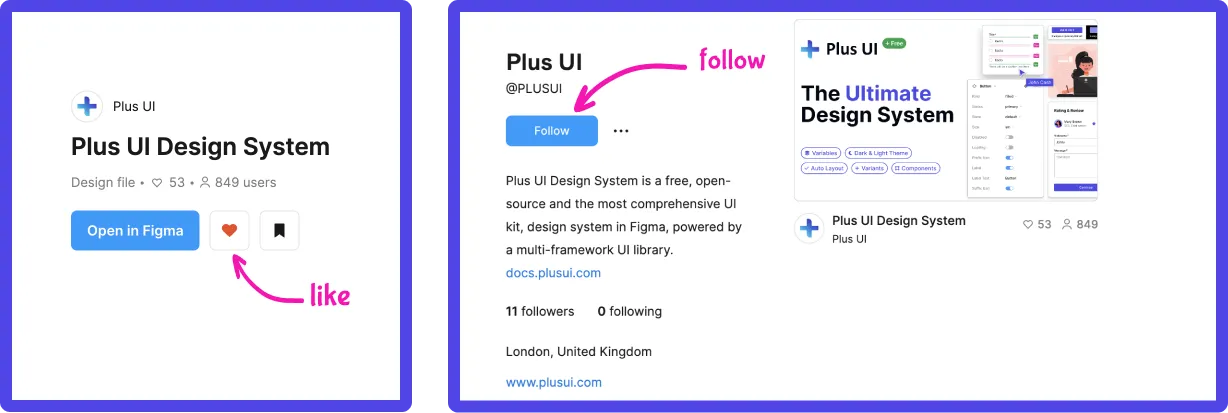
Like & Follow us on Figma Community!
Section titled “Like & Follow us on Figma Community!”Thank you for exploring our design system! It’s the result of nearly a year of dedicated crafting, and we believe it will elevate your design processes—making them faster, stronger, and smoother. If you find our free, open-source design system valuable, we kindly ask for your support—give a like ❤.️
Join the Community
Plus UI is built by the community. Join us on our platforms to contribute, get help, and stay up to date.