


Segmented Picker
A control allowing users to select one option from a linear set, often used for view switching.
First release: 1.0.0 Latest update: July 1, 2025 Current version: 1.0.0
Import
import { PlusSegmented Picker } from '@plusui/react';import { PlusSegmented PickerComponent } from '@plusui/angular';import { PlusSegmented Picker } from '@plusui/vue';import PlusSegmented Picker from '@plusui/svelte';<script src="https://cdn.jsdelivr.net/npm/@plusui/core"></script>Package
@plusui/react@plusui/angular@plusui/vue@plusui/svelte@plusui/coreDocs
Changelog
Segmented picker Changelog
Recent changes and updates for the segmented picker component
No entries found
No changelog entries found for segmented picker component.
The Segmented Picker (plus-segmented-picker) presents a set of related options (plus-segmented-picker-item) in a compact, linear format, allowing users to select only one option at a time. It’s commonly used for toggling between different views or modes.
Anatomy
Section titled “Anatomy”
Basic Example
Section titled “Basic Example”A simple segmented picker with three options.
List
Grid
Map
import { PlusSegmentedPicker, PlusSegmentedPickerItem } from '@plusui/react';import { useState } from 'react';
export default () => {  const [selectedValue, setSelectedValue] = useState('list');
  const handleChange = (event: any) => {    setSelectedValue(event.detail.value);    console.log('Selected:', event.detail.value);  };
  return (    <PlusSegmentedPicker status="primary" shape="circle" onPlusSegmentedPickerItemChanged={handleChange}>      <PlusSegmentedPickerItem value="list" checked={selectedValue === 'list'}>        <i className="fa-solid fa-list"></i> List      </PlusSegmentedPickerItem>      <PlusSegmentedPickerItem value="grid" checked={selectedValue === 'grid'}>        <i className="fa-solid fa-grip"></i> Grid      </PlusSegmentedPickerItem>      <PlusSegmentedPickerItem value="map" checked={selectedValue === 'map'}>        <i className="fa-solid fa-map"></i> Map      </PlusSegmentedPickerItem>    </PlusSegmentedPicker>  );};
import { Component } from '@angular/core';
@Component({ selector: 'app-segmented-basic', template: ` <plus-segmented-picker status="primary" shape="circle" (plus-segmented-picker-item-changed)="handleChange($event)"> <plus-segmented-picker-item value="list" checked> <i class="fa-solid fa-list"></i> List </plus-segmented-picker-item> <plus-segmented-picker-item value="grid"> <i class="fa-solid fa-grip"></i> Grid </plus-segmented-picker-item> <plus-segmented-picker-item value="map"> <i class="fa-solid fa-map"></i> Map </plus-segmented-picker-item> </plus-segmented-picker> <p>Selected: {{ selectedValue }}</p> `})export class SegmentedBasicComponent { selectedValue = 'list';
handleChange(event: any) { this.selectedValue = event.detail.value; console.log('Selected:', event.detail.value); }}<template> <plus-segmented-picker status="primary" shape="circle" @plus-segmented-picker-item-changed="handleChange"> <plus-segmented-picker-item value="list" :checked="selectedValue === 'list'"> <i class="fa-solid fa-list"></i> List </plus-segmented-picker-item> <plus-segmented-picker-item value="grid" :checked="selectedValue === 'grid'"> <i class="fa-solid fa-grip"></i> Grid </plus-segmented-picker-item> <plus-segmented-picker-item value="map" :checked="selectedValue === 'map'"> <i class="fa-solid fa-map"></i> Map </plus-segmented-picker-item> </plus-segmented-picker> <p>Selected: {{ selectedValue }}</p></template>
<script setup>import { ref } from 'vue';
const selectedValue = ref('list');
const handleChange = (event) => { selectedValue.value = event.detail.value; console.log('Selected:', event.detail.value);};</script><script> let selectedValue = 'list';
function handleChange(event) { selectedValue = event.detail.value; console.log('Selected:', event.detail.value); }</script>
<plus-segmented-picker status="primary" shape="circle" on:plus-segmented-picker-item-changed={handleChange}> <plus-segmented-picker-item value="list" checked={selectedValue === 'list'}> <i class="fa-solid fa-list"></i> List </plus-segmented-picker-item> <plus-segmented-picker-item value="grid" checked={selectedValue === 'grid'}> <i class="fa-solid fa-grip"></i> Grid </plus-segmented-picker-item> <plus-segmented-picker-item value="map" checked={selectedValue === 'map'}> <i class="fa-solid fa-map"></i> Map </plus-segmented-picker-item></plus-segmented-picker><p>Selected: {selectedValue}</p>Set the size prop on the plus-segmented-picker to control the size of all items.
import { PlusSegmentedPicker, PlusSegmentedPickerItem } from '@plusui/react';
export default () => {  return (    <>      <PlusSegmentedPicker size="sm" status="primary">        <PlusSegmentedPickerItem value="a" checked>          Sm A        </PlusSegmentedPickerItem>        <PlusSegmentedPickerItem value="b">          Sm B        </PlusSegmentedPickerItem>      </PlusSegmentedPicker>      <PlusSegmentedPicker size="md" status="primary">        <PlusSegmentedPickerItem value="a" checked>          Md A        </PlusSegmentedPickerItem>        <PlusSegmentedPickerItem value="b">          Md B        </PlusSegmentedPickerItem>      </PlusSegmentedPicker>      <PlusSegmentedPicker size="lg" status="primary">        <PlusSegmentedPickerItem value="a" checked>          Lg A        </PlusSegmentedPickerItem>        <PlusSegmentedPickerItem value="b">          Lg B        </PlusSegmentedPickerItem>      </PlusSegmentedPicker>    </>  );};
import { Component } from '@angular/core';
@Component({ selector: 'app-example', template: ` <plus-segmented-picker size="sm" status="primary"> <plus-segmented-picker-item value="a" checked> Sm A </plus-segmented-picker-item> <plus-segmented-picker-item value="b"> Sm B </plus-segmented-picker-item> </plus-segmented-picker> <plus-segmented-picker size="md" status="primary"> <plus-segmented-picker-item value="a" checked> Md A </plus-segmented-picker-item> <plus-segmented-picker-item value="b"> Md B </plus-segmented-picker-item> </plus-segmented-picker> <plus-segmented-picker size="lg" status="primary"> <plus-segmented-picker-item value="a" checked> Lg A </plus-segmented-picker-item> <plus-segmented-picker-item value="b"> Lg B </plus-segmented-picker-item> </plus-segmented-picker> `})export class ExampleComponent {}<template> <plus-segmented-picker size="sm" status="primary"> <plus-segmented-picker-item value="a" checked> Sm A </plus-segmented-picker-item> <plus-segmented-picker-item value="b"> Sm B </plus-segmented-picker-item> </plus-segmented-picker> <plus-segmented-picker size="md" status="primary"> <plus-segmented-picker-item value="a" checked> Md A </plus-segmented-picker-item> <plus-segmented-picker-item value="b"> Md B </plus-segmented-picker-item> </plus-segmented-picker> <plus-segmented-picker size="lg" status="primary"> <plus-segmented-picker-item value="a" checked> Lg A </plus-segmented-picker-item> <plus-segmented-picker-item value="b"> Lg B </plus-segmented-picker-item> </plus-segmented-picker></template><plus-segmented-picker size="sm" status="primary"> <plus-segmented-picker-item value="a" checked> Sm A </plus-segmented-picker-item> <plus-segmented-picker-item value="b"> Sm B </plus-segmented-picker-item></plus-segmented-picker><plus-segmented-picker size="md" status="primary"> <plus-segmented-picker-item value="a" checked> Md A </plus-segmented-picker-item> <plus-segmented-picker-item value="b"> Md B </plus-segmented-picker-item></plus-segmented-picker><plus-segmented-picker size="lg" status="primary"> <plus-segmented-picker-item value="a" checked> Lg A </plus-segmented-picker-item> <plus-segmented-picker-item value="b"> Lg B </plus-segmented-picker-item></plus-segmented-picker><plus-segmented-picker size="sm" status="primary"> <plus-segmented-picker-item value="a" checked> Sm A </plus-segmented-picker-item> <plus-segmented-picker-item value="b"> Sm B </plus-segmented-picker-item></plus-segmented-picker><plus-segmented-picker size="md" status="primary"> <plus-segmented-picker-item value="a" checked> Md A </plus-segmented-picker-item> <plus-segmented-picker-item value="b"> Md B </plus-segmented-picker-item></plus-segmented-picker><plus-segmented-picker size="lg" status="primary"> <plus-segmented-picker-item value="a" checked> Lg A </plus-segmented-picker-item> <plus-segmented-picker-item value="b"> Lg B </plus-segmented-picker-item></plus-segmented-picker>The shape prop on plus-segmented-picker controls the rounding of the container and the selection overlay.
import { PlusSegmentedPicker, PlusSegmentedPickerItem } from '@plusui/react';
export default () => {  return (    <>      <PlusSegmentedPicker shape="square" status="primary">        <PlusSegmentedPickerItem value="a" checked>          Square A        </PlusSegmentedPickerItem>        <PlusSegmentedPickerItem value="b">          Square B        </PlusSegmentedPickerItem>      </PlusSegmentedPicker>      <PlusSegmentedPicker shape="circle" status="primary">        <PlusSegmentedPickerItem value="a" checked>          Circle A        </PlusSegmentedPickerItem>        <PlusSegmentedPickerItem value="b">          Circle B        </PlusSegmentedPickerItem>      </PlusSegmentedPicker>    </>  );};
import { Component } from '@angular/core';
@Component({ selector: 'app-example', template: ` <plus-segmented-picker shape="square" status="primary"> <plus-segmented-picker-item value="a" checked> Square A </plus-segmented-picker-item> <plus-segmented-picker-item value="b"> Square B </plus-segmented-picker-item> </plus-segmented-picker> <plus-segmented-picker shape="circle" status="primary"> <plus-segmented-picker-item value="a" checked> Circle A </plus-segmented-picker-item> <plus-segmented-picker-item value="b"> Circle B </plus-segmented-picker-item> </plus-segmented-picker> `})export class ExampleComponent {}<template> <plus-segmented-picker shape="square" status="primary"> <plus-segmented-picker-item value="a" checked> Square A </plus-segmented-picker-item> <plus-segmented-picker-item value="b"> Square B </plus-segmented-picker-item> </plus-segmented-picker> <plus-segmented-picker shape="circle" status="primary"> <plus-segmented-picker-item value="a" checked> Circle A </plus-segmented-picker-item> <plus-segmented-picker-item value="b"> Circle B </plus-segmented-picker-item> </plus-segmented-picker></template><plus-segmented-picker shape="square" status="primary"> <plus-segmented-picker-item value="a" checked> Square A </plus-segmented-picker-item> <plus-segmented-picker-item value="b"> Square B </plus-segmented-picker-item></plus-segmented-picker><plus-segmented-picker shape="circle" status="primary"> <plus-segmented-picker-item value="a" checked> Circle A </plus-segmented-picker-item> <plus-segmented-picker-item value="b"> Circle B </plus-segmented-picker-item></plus-segmented-picker><plus-segmented-picker shape="square" status="primary"> <plus-segmented-picker-item value="a" checked> Square A </plus-segmented-picker-item> <plus-segmented-picker-item value="b"> Square B </plus-segmented-picker-item></plus-segmented-picker><plus-segmented-picker shape="circle" status="primary"> <plus-segmented-picker-item value="a" checked> Circle A </plus-segmented-picker-item> <plus-segmented-picker-item value="b"> Circle B </plus-segmented-picker-item></plus-segmented-picker>Status
Section titled “Status”The status prop changes the color scheme, typically used to highlight the picker or match a theme.
import { PlusSegmentedPicker, PlusSegmentedPickerItem } from '@plusui/react';
export default () => {  return (    <>      <PlusSegmentedPicker status="default" shape="circle">        <PlusSegmentedPickerItem value="a" checked>          Default A        </PlusSegmentedPickerItem>        <PlusSegmentedPickerItem value="b">          Default B        </PlusSegmentedPickerItem>      </PlusSegmentedPicker>      <PlusSegmentedPicker status="primary" shape="circle">        <PlusSegmentedPickerItem value="a" checked>          Primary A        </PlusSegmentedPickerItem>        <PlusSegmentedPickerItem value="b">          Primary B        </PlusSegmentedPickerItem>      </PlusSegmentedPicker>    </>  );};
import { Component } from '@angular/core';
@Component({ selector: 'app-example', template: ` <plus-segmented-picker status="default" shape="circle"> <plus-segmented-picker-item value="a" checked> Default A </plus-segmented-picker-item> <plus-segmented-picker-item value="b"> Default B </plus-segmented-picker-item> </plus-segmented-picker> <plus-segmented-picker status="primary" shape="circle"> <plus-segmented-picker-item value="a" checked> Primary A </plus-segmented-picker-item> <plus-segmented-picker-item value="b"> Primary B </plus-segmented-picker-item> </plus-segmented-picker> `})export class ExampleComponent {}<template> <plus-segmented-picker status="default" shape="circle"> <plus-segmented-picker-item value="a" checked> Default A </plus-segmented-picker-item> <plus-segmented-picker-item value="b"> Default B </plus-segmented-picker-item> </plus-segmented-picker> <plus-segmented-picker status="primary" shape="circle"> <plus-segmented-picker-item value="a" checked> Primary A </plus-segmented-picker-item> <plus-segmented-picker-item value="b"> Primary B </plus-segmented-picker-item> </plus-segmented-picker></template><plus-segmented-picker status="default" shape="circle"> <plus-segmented-picker-item value="a" checked> Default A </plus-segmented-picker-item> <plus-segmented-picker-item value="b"> Default B </plus-segmented-picker-item></plus-segmented-picker><plus-segmented-picker status="primary" shape="circle"> <plus-segmented-picker-item value="a" checked> Primary A </plus-segmented-picker-item> <plus-segmented-picker-item value="b"> Primary B </plus-segmented-picker-item></plus-segmented-picker><plus-segmented-picker status="default" shape="circle"> <plus-segmented-picker-item value="a" checked> Default A </plus-segmented-picker-item> <plus-segmented-picker-item value="b"> Default B </plus-segmented-picker-item></plus-segmented-picker><plus-segmented-picker status="primary" shape="circle"> <plus-segmented-picker-item value="a" checked> Primary A </plus-segmented-picker-item> <plus-segmented-picker-item value="b"> Primary B </plus-segmented-picker-item></plus-segmented-picker>Disabled Items
Section titled “Disabled Items”Set the disabled attribute on individual plus-segmented-picker-item components to prevent their selection.
import { PlusSegmentedPicker, PlusSegmentedPickerItem } from '@plusui/react';
export default () => {  return (    <>      <PlusSegmentedPicker status="primary">        <PlusSegmentedPickerItem value="a" checked>          Enabled A        </PlusSegmentedPickerItem>        <PlusSegmentedPickerItem value="b" disabled>          Disabled B        </PlusSegmentedPickerItem>        <PlusSegmentedPickerItem value="c">          Enabled C        </PlusSegmentedPickerItem>      </PlusSegmentedPicker>    </>  );};
import { Component } from '@angular/core';
@Component({ selector: 'app-example', template: ` <plus-segmented-picker status="primary"> <plus-segmented-picker-item value="a" checked> Enabled A </plus-segmented-picker-item> <plus-segmented-picker-item value="b" disabled> Disabled B </plus-segmented-picker-item> <plus-segmented-picker-item value="c"> Enabled C </plus-segmented-picker-item> </plus-segmented-picker> `})export class ExampleComponent {}<template> <plus-segmented-picker status="primary"> <plus-segmented-picker-item value="a" checked> Enabled A </plus-segmented-picker-item> <plus-segmented-picker-item value="b" disabled> Disabled B </plus-segmented-picker-item> <plus-segmented-picker-item value="c"> Enabled C </plus-segmented-picker-item> </plus-segmented-picker></template><plus-segmented-picker status="primary"> <plus-segmented-picker-item value="a" checked> Enabled A </plus-segmented-picker-item> <plus-segmented-picker-item value="b" disabled> Disabled B </plus-segmented-picker-item> <plus-segmented-picker-item value="c"> Enabled C </plus-segmented-picker-item></plus-segmented-picker><plus-segmented-picker status="primary"> <plus-segmented-picker-item value="a" checked> Enabled A </plus-segmented-picker-item> <plus-segmented-picker-item value="b" disabled> Disabled B </plus-segmented-picker-item> <plus-segmented-picker-item value="c"> Enabled C </plus-segmented-picker-item></plus-segmented-picker>Handling Events
Section titled “Handling Events”Listen to selection changes for dynamic behavior.
import { PlusSegmentedPicker, PlusSegmentedPickerItem } from '@plusui/react';import { useState } from 'react';
export default () => {  const [selectedValue, setSelectedValue] = useState('option1');
  const handleChange = (event: any) => {    setSelectedValue(event.detail.value);    console.log('Selection changed to:', event.detail.value);  };
  return (    <PlusSegmentedPicker status="primary" onPlusSegmentedPickerItemChanged={handleChange}>      <PlusSegmentedPickerItem value="option1" checked={selectedValue === 'option1'}>        Option 1      </PlusSegmentedPickerItem>      <PlusSegmentedPickerItem value="option2" checked={selectedValue === 'option2'}>        Option 2      </PlusSegmentedPickerItem>      <PlusSegmentedPickerItem value="option3" checked={selectedValue === 'option3'}>        Option 3      </PlusSegmentedPickerItem>    </PlusSegmentedPicker>  );};
import { Component } from '@angular/core';
@Component({ selector: 'app-segmented-events', template: ` <plus-segmented-picker status="primary" (plus-segmented-picker-item-changed)="handleChange($event)"> <plus-segmented-picker-item value="option1" [checked]="selectedValue === 'option1'"> Option 1 </plus-segmented-picker-item> <plus-segmented-picker-item value="option2" [checked]="selectedValue === 'option2'"> Option 2 </plus-segmented-picker-item> <plus-segmented-picker-item value="option3" [checked]="selectedValue === 'option3'"> Option 3 </plus-segmented-picker-item> </plus-segmented-picker> `})export class SegmentedEventsComponent { selectedValue = 'option1';
handleChange(event: any) { this.selectedValue = event.detail.value; console.log('Selection changed to:', event.detail.value); }}<template> <plus-segmented-picker status="primary" @plus-segmented-picker-item-changed="handleChange"> <plus-segmented-picker-item value="option1" :checked="selectedValue === 'option1'"> Option 1 </plus-segmented-picker-item> <plus-segmented-picker-item value="option2" :checked="selectedValue === 'option2'"> Option 2 </plus-segmented-picker-item> <plus-segmented-picker-item value="option3" :checked="selectedValue === 'option3'"> Option 3 </plus-segmented-picker-item> </plus-segmented-picker></template>
<script setup>import { ref } from 'vue';
const selectedValue = ref('option1');
const handleChange = (event) => { selectedValue.value = event.detail.value; console.log('Selection changed to:', event.detail.value);};</script><script> let selectedValue = 'option1';
function handleChange(event) { selectedValue = event.detail.value; console.log('Selection changed to:', event.detail.value); }</script>
<plus-segmented-picker status="primary" on:plus-segmented-picker-item-changed={handleChange}> <plus-segmented-picker-item value="option1" checked={selectedValue === 'option1'}> Option 1 </plus-segmented-picker-item> <plus-segmented-picker-item value="option2" checked={selectedValue === 'option2'}> Option 2 </plus-segmented-picker-item> <plus-segmented-picker-item value="option3" checked={selectedValue === 'option3'}> Option 3 </plus-segmented-picker-item></plus-segmented-picker><plus-segmented-picker status="primary" id="event-segmented-picker"> <plus-segmented-picker-item value="option1" checked>Option 1</plus-segmented-picker-item> <plus-segmented-picker-item value="option2">Option 2</plus-segmented-picker-item> <plus-segmented-picker-item value="option3">Option 3</plus-segmented-picker-item></plus-segmented-picker>
<script> const picker = document.getElementById('event-segmented-picker');
picker.addEventListener('plus-segmented-picker-item-changed', (event) => { console.log('Selection changed to:', event.detail.value); });</script>Visual Sections
Section titled “Visual Sections”Layout & Spacing
Section titled “Layout & Spacing”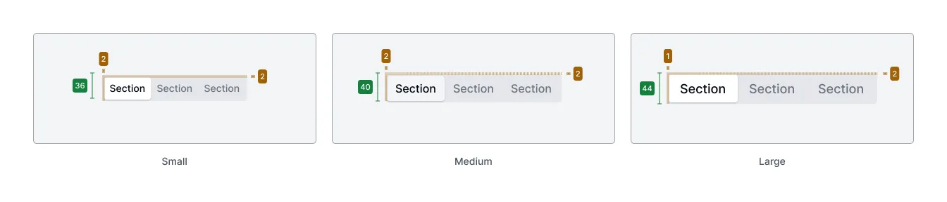
Light & Dark Mode
Section titled “Light & Dark Mode”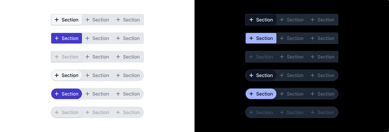
Accessibility (a11y)
Section titled “Accessibility (a11y)”- Keyboard Behavior:
- The segmented picker container (
plus-segmented-picker) is part of the tab order. - When the container has focus,
ArrowLeft/ArrowRightnavigate between items, updating the selection and moving focus accordingly. Navigation wraps around. Homeselects the first non-disabled item.Endselects the last non-disabled item.EnterorSpacetypically aren’t needed as selection follows focus, but could be implemented for activation if needed.
- The segmented picker container (
- Screen Reader:
- The
plus-segmented-pickercontainer usesrole="radiogroup". - Each
plus-segmented-picker-itemusesrole="radio"witharia-checkedreflecting its selection state. - Labels for each item are derived from their slotted content.
- Disabled items have
aria-disabled="true".
- The
- Required Developer Actions:
- Provide an accessible label for the
plus-segmented-pickercontainer itself, typically usingaria-labeloraria-labelledby. - Ensure each
plus-segmented-picker-itemhas meaningful content (text or icons with accessible labels) in its default slot. - Assign a unique and descriptive
valueto eachplus-segmented-picker-item.
- Provide an accessible label for the
API Reference
Section titled “API Reference”plus-segmented-picker
Section titled “plus-segmented-picker”Properties
Section titled “Properties”| Name | Type | Default | Description | Required |
|---|---|---|---|---|
status | 'default' | 'primary' | 'default' | Color scheme of the picker. Passed to items. | No |
shape | 'square' | 'circle' | 'square' | Overall shape (rounding) of the picker. Passed to items. | No |
size | 'sm' | 'md' | 'lg' | 'md' | Size of the picker and its items. Passed to items. | No |
Events
Section titled “Events”| Name | Payload Type | Description |
|---|---|---|
plus-segmented-picker-item-changed | CustomEvent<{value: string}> | Fired when the selected item changes. |
| Name | Description |
|---|---|
(default) | Contains the plus-segmented-picker-item elements for the picker. |
CSS Shadow Parts
Section titled “CSS Shadow Parts”| Name | Description |
|---|---|
host | The main host container element. |
animation-overlay | The overlay element used for selection animation. |
plus-segmented-picker-item
Section titled “plus-segmented-picker-item”Properties
Section titled “Properties”| Name | Type | Default | Description | Required |
|---|---|---|---|---|
checked | boolean | false | Whether the item is currently selected. | No |
status | 'default' | 'primary' | 'default' | Color scheme (inherited from parent picker). | No |
disabled | boolean | false | Disables the item, preventing selection. | No |
shape | 'square' | 'circle' | 'square' | Shape (rounding) (inherited from parent picker). | No |
size | 'sm' | 'md' | 'lg' | 'md' | Size (inherited from parent picker). | No |
groupName | string | '' | Internal property to group items (set by parent picker). | No |
value | string | '' | The value associated with this item. | Yes |
Events
Section titled “Events”This component primarily communicates selection changes through the parent plus-segmented-picker’s plus-segmented-picker-item-changed event.
| Name | Description |
|---|---|
(default) | The content displayed inside the item (text, icon, etc.). |
CSS Shadow Parts
Section titled “CSS Shadow Parts”| Name | Description |
|---|---|
label | The label element wrapping the slot content. |
input | The hidden radio input element. |
Join the Community
Plus UI is built by the community. Join us on our platforms to contribute, get help, and stay up to date.